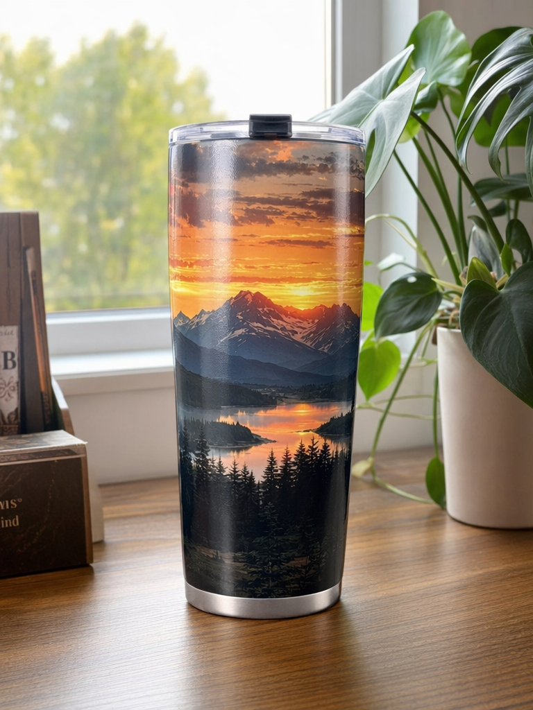
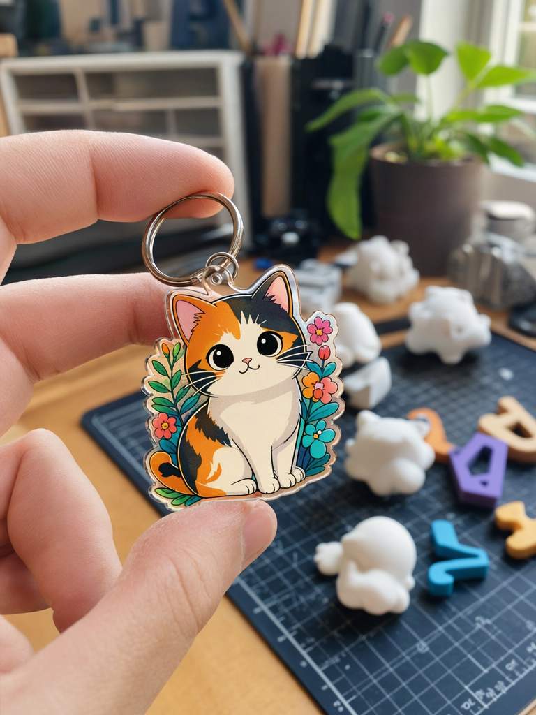
When you publish project in the community , your cover is the first thing people see in the community feed. A good cover gets clicks—more clicks mean more prints.
This guide covers: what makes a great cover, how to fix common issues, and how to shoot each type of project.
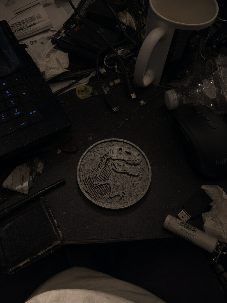
❌ Bad
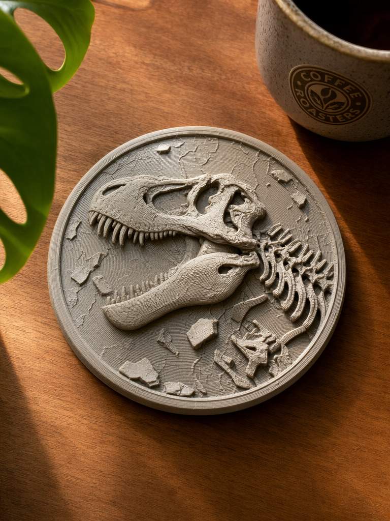
✅ Good
Messy background, dark lighting—attention stolen by clutter
Clean background, bright lighting—project is crystal clear
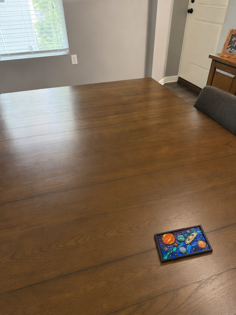
❌ Bad
✅ Good
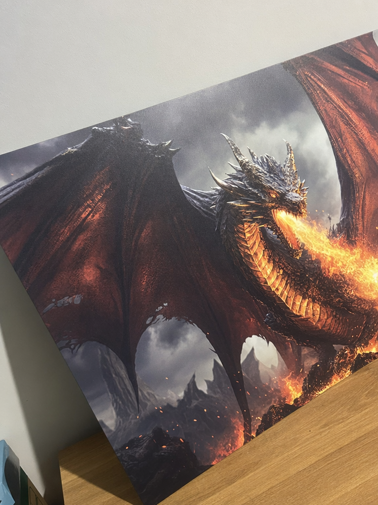
Project tiny in the corner, too much empty space—can't see anything in thumbnail
Project fills the frame, clear even at small size
❌ Bad
✅ Good
Shot too close, design cropped at the edges—can't even see the full product
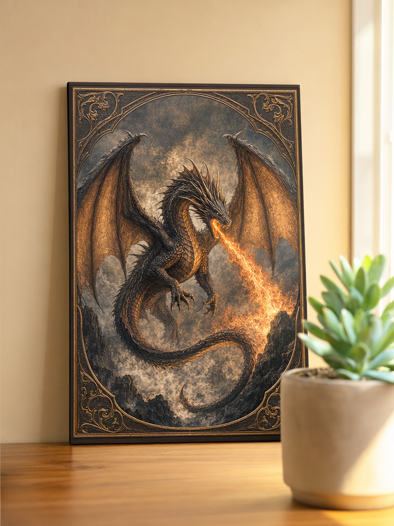
Proper margins, complete design fully visible—see the whole thing at a glance
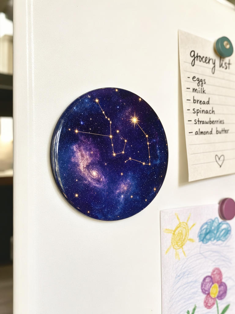
❌ Bad
✅ Good
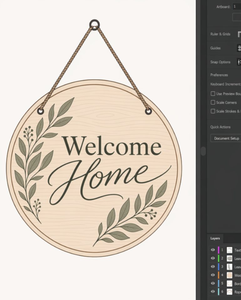
design alone—hard to imagine what it looks like in use
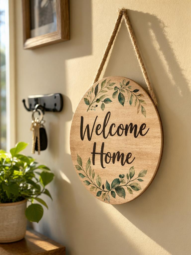
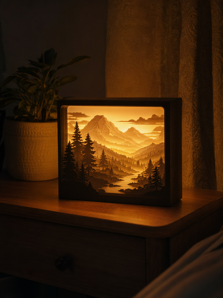
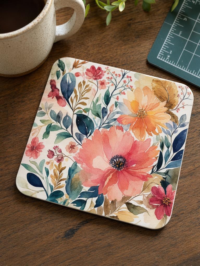
In-use shot—coaster with a cup, wall art on the wall, tumbler in hand
❌ Bad
✅ Good
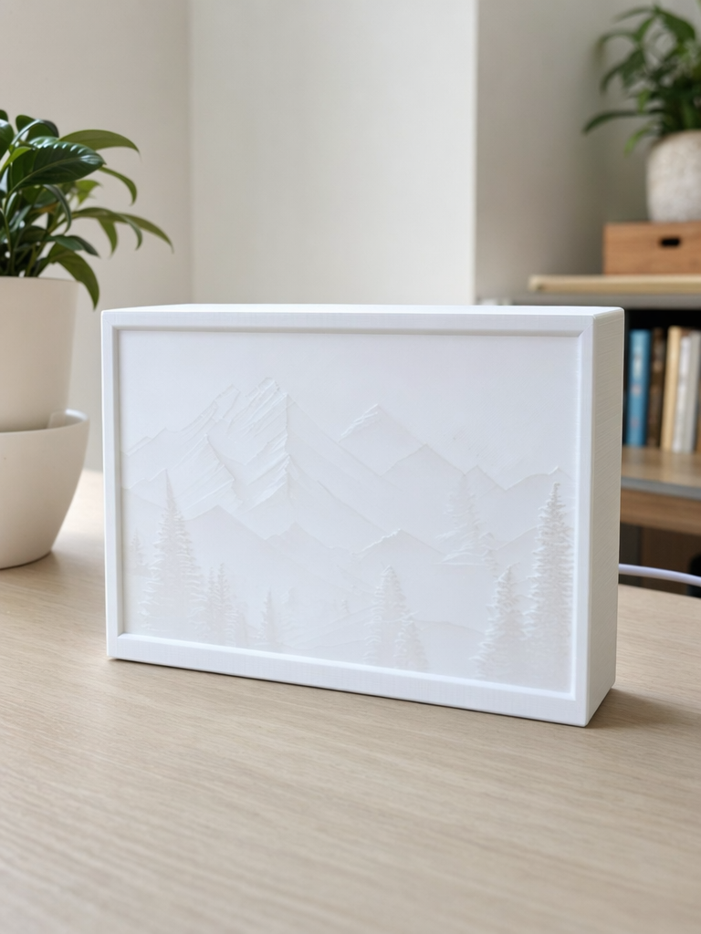
Shot in daylight without turning on the light—just a plain acrylic sheet
Lights off, lamp box on—the glow is everything
Can you tell what it is at a glance?
Is the background clean?
Is the lighting bright enough?
Do the colors match the real thing?
The community supports uploading multiple images; we recommend organizing them as follows:
Image 1: Usage scenario—a cup on a coaster, a painting on the wall, or a lightbox illuminated on the nightstand
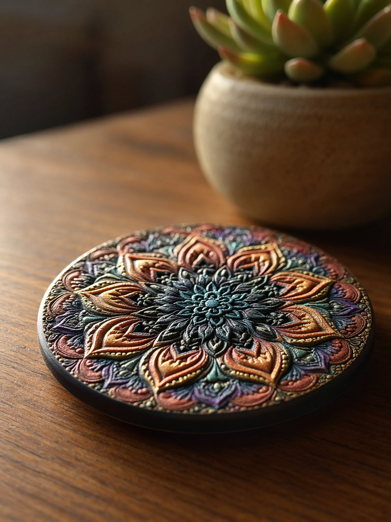
Image 2: Close-up details—get up close to capture textures and materials
Image 3: A different angle—show the back or side
Image 4: Design mockup
Did you get it? Try it now!
→ https://makeitreal-beta.eufymake.com/